library(tidyverse)  # for dplyr, ggplot2, stringr packages
library(patchwork) # for positioning multiple plotsIntroduction
Quist et al. (2022) examined three structures (scales, sectioned otoliths, and whole otoliths) to estimate age of Yellowstone Cutthroat Trout (Oncorhynchus clarkii bouvieri). Their published paper included a supplement with the data they used to estimate age precision and bias between readers and between structures.
A previous post demonstrated my preferred methods for displaying such data. Here, as I continue to hone my ggplot2 skills, I did not follow my preferences but rather tried to recreate Figures 1 and 2 in Quist et al. (2022). My process is described below.
Getting Setup
The following packages are loaded for use below.
The following ggplot2 theme was used below.1
1 See this post for more information on creating and using ggplot2 themes.
theme_q <- function(base_size=14) {
  theme_bw(base_size=base_size) +
    theme(
      # margin for the plot
      plot.margin=unit(c(0.5,0.5,0.5,0.5),"cm"),
      # set axis label (i.e., title) colors and margins
      axis.title.y=element_text(colour="black",margin=margin(t=0,r=10,b=0,l=0)),
      axis.title.x=element_text(colour="black",margin=margin(t=10,r=0,b=0,l=0)),
      # set tick label color, margin, and position and orientation
      axis.text.y=element_text(colour="black",margin=margin(t=0,r=5,b=0,l=0),
                               vjust=0.5,hjust=1),
      axis.text.x=element_text(colour="black",margin=margin(t=5,r=0,b=0,l=0),
                               vjust=0,hjust=0.5,),
      # set size of the tick marks for y- and x-axis
      axis.ticks=element_line(linewidth=0.5),
      # adjust length of the tick marks
      axis.ticks.length=unit(0.2,"cm"),
      # set the axis size,color,and end shape
      axis.line=element_line(colour="black",linewidth=0.5,lineend="square"),
      # adjust size of text for legend
      legend.text=element_text(size=12),
      # remove grid
      panel.grid=element_blank()
    )
}
Data
I downloaded the Excel file provided as a supplement to the published paper to my local drive and named it “quistetal_2022.xlsx”. The authors used “.” for missing data which I addressed with na= in read_excel() below. The authors also recorded “confidence” values for each age assignment but those were not used in any analysis here so I removed them. Names for the remaining variables were long and somewhat inconsistent so I renamed those to be shorter and consistent.2
2 Note that as.data.frame() is used to remove the tibble class returned from read_excel() that I don’t prefer.
df <- readxl::read_excel("quist_etal_2022.xlsx",na=c("",".")) |>
  select(-contains("Confidence")) |>
  rename(scale_r1=`Reader_1_Scale_age`,
         scale_r2=`Reader_2_Scale_age`,
         scale_age=`Consensus_scale_age`,
         soto_r1=`Reader_1_Sectioned_Otolith_age`,
         soto_r2=`Reader_2_Sectioned_Otolith_age`,
         soto_age=`Consensus_Sectioned_Otolith_Age`,
         woto_r1=`Reader_1_Whole_Otolith_age`,
         woto_r2=`Reader_2_Whole_Otolith_age`,
         woto_age=`Consensus_Whole_Otolith`) |>
  as.data.frame()
head(df)
#R| Length Year scale_r1 scale_r2 scale_age soto_r1 soto_r2 soto_age woto_r1
#R| 1 168 2019 1 1 1 1 1 1 NA
#R| 2 169 2019 1 1 1 1 1 1 1
#R| 3 172 2019 1 2 1 2 1 1 NA
#R| 4 175 2020 1 1 1 2 2 2 2
#R| 5 178 2019 1 1 1 1 1 1 1
#R| 6 216 2020 2 2 2 2 2 2 NA
#R| woto_r2 woto_age
#R| 1 NA NA
#R| 2 1 1
#R| 3 NA NA
#R| 4 1 1
#R| 5 1 1
#R| 6 NA NAFigures 1 and 2 in Quist et al. (2022) each used axis labels that ranged from 0 to 12 and were only shown for even values. Those limits and labels are set here for ease and consistency below.
axlbls <- seq(0,12,2)
axlmts <- range(axlbls)
Plot One Structure
I begin by showing how to create one panel (i.e., for estimate age between readers for one structure) of Figure 1.
I first created a summary data frame that has the number of observations for each combination of age estimates by each reader. For example, there were three instances where each reader assigned an age of 1 and two instances where reader 1 assigned an age of 1 but reader 2 assigned and age of 2.
df_wo <- df |>
  group_by(woto_r1,woto_r2) |>
  summarize(freq=n()) |>
  as.data.frame()
head(df_wo)
#R| woto_r1 woto_r2 freq
#R| 1 1 1 3
#R| 2 1 2 2
#R| 3 2 1 2
#R| 4 2 2 114
#R| 5 2 3 28
#R| 6 2 4 1agePrecision() from FSA was then used to compute a variety of age precision statistics between the two readers. For these purposes, note that exact percent agreement is returned in $PercAgree and the average coefficient of variation is returned in $ACV of the object saved from agePrecision().
ap_wo <- FSA::agePrecision(woto_r2~woto_r1,data=df)
str(ap_wo)
#R| List of 14
#R| $ detail :'data.frame': 416 obs. of 12 variables:
#R| ..$ woto_r2: num [1:416] NA 1 NA 1 1 NA 2 2 1 2 ...
#R| ..$ woto_r1: num [1:416] NA 1 NA 2 1 NA 2 2 1 2 ...
#R| ..$ mean : num [1:416] NA 1 NA 1.5 1 NA 2 2 1 2 ...
#R| ..$ median : num [1:416] NA 1 NA 1.5 1 NA 2 2 1 2 ...
#R| ..$ mode : num [1:416] NA 1 NA NA 1 NA 2 2 1 2 ...
#R| ..$ SD : num [1:416] NA 0 NA 0.707 0 ...
#R| ..$ CV : num [1:416] NA 0 NA 47.1 0 ...
#R| ..$ CV2 : num [1:416] NA 0 NA 47.1 0 ...
#R| ..$ AD : num [1:416] NA 0 NA 0.5 0 NA 0 0 0 0 ...
#R| ..$ PE : num [1:416] NA 0 NA 33.3 0 ...
#R| ..$ PE2 : num [1:416] NA 0 NA 33.3 0 ...
#R| ..$ D : num [1:416] NA 0 NA 33.3 0 ...
#R| $ rawdiff : 'table' int [1:7(1d)] 2 36 248 82 6 0 1
#R| ..- attr(*, "dimnames")=List of 1
#R| .. ..$ : chr [1:7] "-2" "-1" "0" "1" ...
#R| $ absdiff : 'table' int [1:5(1d)] 248 118 8 0 1
#R| ..- attr(*, "dimnames")=List of 1
#R| .. ..$ : chr [1:5] "0" "1" "2" "3" ...
#R| $ ASD : num 0.26
#R| $ ACV : num 7.81
#R| $ ACV2 : num 7.81
#R| $ AAD : num 0.184
#R| $ APE : num 5.52
#R| $ APE2 : num 5.52
#R| $ AD : num 5.52
#R| $ PercAgree: num 66.1
#R| $ R : int 2
#R| $ n : int 416
#R| $ validn : int 375
#R| - attr(*, "class")= chr "agePrec"Quist et al. (2022) also reported “PA-1” (i.e., the percent agreement within one age), which is not returned by agePrecision(). This value can, however, be calculated by summing the first two values in $absDiff (these are the counts of perfect agreement and agreement within one age) and dividing by the total number of paired assignments in $validn.
sum(ap_wo$absdiff[1:2])/ap_wo$validn*100#R| [1] 97.6Quist et al. (2022) annotated their plots with these three summary values. Below I use str_glue() to concatenate together these values into a single string that will be added to the plots below. In the use of str_glue() below the three summary measures are assigned to objects named PA, PA1, and CV (last three lines) and those values are then inserted into the string (first four lines) within the {} delimiters. I also used formatC() is used to format the string to one decimal place and that \n is a “carriage return” that starts a new line in the string.
lbl_wo <- str_glue("Whole Otoliths\n",
                   "PA = {PA}%\n",
                   "PA-1 = {PA1}%\n",
                   "CV = {CV}",
                   PA=formatC(ap_wo$PercAgree,format='f',digits=1),
                   PA1=formatC(sum(ap_wo$absdiff[1:2])/ap_wo$validn*100,format='f',digits=1),
                   CV=formatC(ap_wo$ACV,format='f',digits=1))
lbl_wo
#R| Whole Otoliths
#R| PA = 66.1%
#R| PA-1 = 97.6%
#R| CV = 7.8Finally, the plot is made by first3 adding the 1:1 reference line with geom_a line(), the frequency of age estimates with geom_label(), and the summary results as text with annotate(). The arguments in geom_label() remove the rounded edges of the boxes (i.e., label.r) and attempt to make the boxes larger to more closely abut as in Quist et al. (2022). The arguments in annotate() put the label at the minimum x and maximum y values, then vertically and horizontally adjust that text box so that the upper-left corner is just inside the upper-left corner of the plot. Finally, the expansion factors are removed from both axes and both axes are limited to and labeled with the limits and labels set above.
3 So that it appears behind the numbers.
rs_wo <- ggplot(data=df_wo,mapping=aes(x=woto_r1,y=woto_r2,label=freq)) +
  geom_abline(slope=1,intercept=0) +
  geom_label(label.r=unit(0,"lines"),label.padding=unit(0.3,"lines")) +
  annotate(geom="text",label=lbl_wo,
           x=0,y=12,hjust=-0.1,vjust=1.1,size=4) +
  scale_x_continuous(name="Reader 1",expand=expansion(mult=0),
                     limits=axlmts,breaks=axlbls) +
  scale_y_continuous(name="Reader 2",expand=expansion(mult=0),
                     limits=axlmts,breaks=axlbls) +
  theme_q()
rs_wo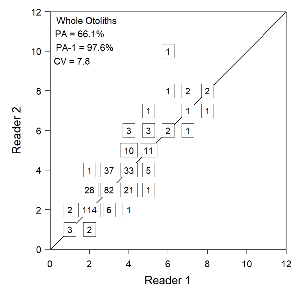
Note
Recreating Figure 1
The code described above can largely be repeated for scales and sectioned otoliths, which I did without showing the code but saving the results in ggplot2 objects called rs_sc and rs_so.
However, when these two objects are combined together with rs_wo to form Figure 1, they should not have a title or labels for the x-axis. The x-axis title and labels are removed by setting axis.title.x= and axis.text.x= in theme() to element_blank() and appending this to each object.4
4 Note that each object is modified and then saved to the same name here.
rs_so <- rs_so +
  theme(axis.title.x=element_blank(),
        axis.text.x=element_blank())
rs_sc <- rs_sc +
  theme(axis.title.x=element_blank(),
        axis.text.x=element_blank())
Finally, the three plots can be stacked on top of each other using patchwork as shown below.5
5 Use smaller values in plot.margin= in theme_q to more closely resemble how close the panels are in Quist et al. (2022).
rs_sc + rs_so + rs_wo +
  plot_layout(ncol=1)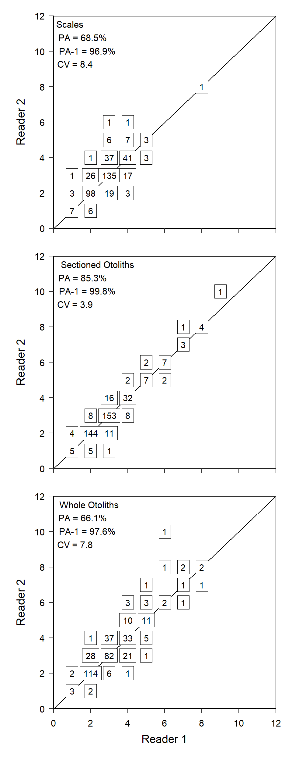
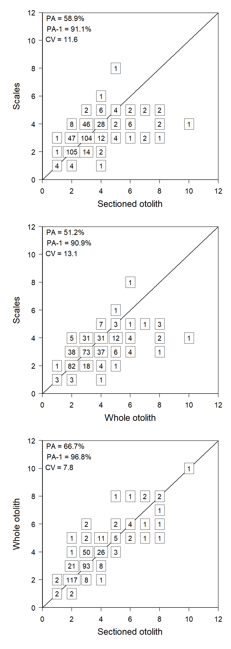
Recreating Figure 2
Figure 2 would follow the same general process as Figure 1 except that the summary results annotation would only have the results and not a “title” and each panel in the figure would have the x-axis title and labels.
References
Quist, M. C., D. K. McCarrick, and L. M. Harris. 2022. Comparison of structures used to estimate age and growth of Yellowstone Cutthroat Trout. Journal of Fish and Wildlife Management 13(2):544–551.
Reuse
Citation
BibTeX citation:
@online{h._ogle2023,
  author = {H. Ogle, Derek},
  title = {Quist Et Al. (2022) {Age} {Comparison} {Figures}},
  date = {2023-02-13},
  url = {https://fishr-core-team.github.io/fishR/blog/posts/2023_2_13_Quistetal2022_AgeData/},
  langid = {en}
}
For attribution, please cite this work as:
H. Ogle, D. 2023, February 13. Quist et al. (2022) Age Comparison
Figures. https://fishr-core-team.github.io/fishR/blog/posts/2023_2_13_Quistetal2022_AgeData/.