library(tidyverse)  # for dplyr, ggplot2 packages
library(scales) # for breaks_width(), label_date()Introduction
Clemens (2022) examined temperature as a mortality threat to Pacific Lamprey (Entosphenus tridentatus). While their Figure 3 is quite simple, it appeared to me that some aspects of the figure were manually drawn rather than being drawn from the data.1 I don’t mean this as a critique because (a) I have done this before and (b) what I illustrate here will not affect the narrative that can be derived from the figure. However, I do want to demonstrate how easy it is with ggplot2 to tie what was manually drawn directly to the data.
1 This is my interpretation from the vertical dashed lines not being directly aligned with the points or the x-axis.
Getting Setup
The following package is loaded for use below.
The ggplot2 theme was set to theme_classic() but with modifications to more closely match the author’s choices (i.e., slightly larger and bolded axis title, more spacing between the axis and the axis tick labels and title, and tick marks that face inward).2
2 The negative length for axis.ticks.length will force the ticks inward.
theme_set(
  theme_classic() +
    theme(axis.title=element_text(size=11,face="bold"),
          axis.title.x=element_text(margin=margin(t=12.5)),
          axis.title.y=element_text(margin=margin(r=12.5)),
          axis.text.x=element_text(margin=margin(t=7.5)),
          axis.text.y=element_text(margin=margin(r=7.5)),
          axis.ticks.length=unit(-5,"pt"))
)
The methods below manipulate a lot of dates. The authors used a numeric day, abbreviated month, and numeric year format for their dates, with each portion separated by a hyphen (e.g., 30-Jun-2021). This format must be declared with each use of as.Date() below, so I entered it here as an object to ensure consistency. Note that the %d indicates a numeric day, %b indicates an abbreviated month, and %Y indicates a four digit year.3
3 See strptime for explanations of other codes.
dfmt <- "%d-%b-%Y"
Get Data
Clemens (2022) did not provide the data so I entered it manually from “eye-balling” their Figure 3. The interesting point here is that seq() will create a sequence of dates if the from= (i.e., first) and to= (i.e., second) arguments are dates.
dat <- data.frame(
  date=seq(as.Date("15-Jun-2021",format=dfmt),
           as.Date("10-Jul-2021",format=dfmt),
           by=1),
  temp=c(20.5,20.8,22.1,23.2,23.9,24.9,26.5,27.1,27.0,27.1,
         27.4,28.3,29.5,30.9,30.0,28.5,26.8,26.0,26.6,27.5,
         27.6,27.3,26.4,26.3,26.2,27.0)
)
FSA::headtail(dat)
#R| date temp
#R| 1 2021-06-15 20.5
#R| 2 2021-06-16 20.8
#R| 3 2021-06-17 22.1
#R| 24 2021-07-08 26.3
#R| 25 2021-07-09 26.2
#R| 26 2021-07-10 27.0
Base Plot
The base plot of a line and points at the recorded temperature for each date is easily constructed with geom_line() and geom_point() by mapping the x-axis to date and the y-axis to temperature. I increased the line width and size of the points slightly from their defaults. Also note that the data= and mapping= are declared within the geom_s rather than within ggplot() because a second data frame is going to be used in the next section to add vertical reference lines.4
4 Recall from previous posts that if geom_s use different data frames than all data frames should be declared in the geom_s rather than in ggplot().
ggplot() +
  geom_line(data=dat,mapping=aes(x=date,y=temp),
            linewidth=1) +
  geom_point(data=dat,mapping=aes(x=date,y=temp),
             size=2)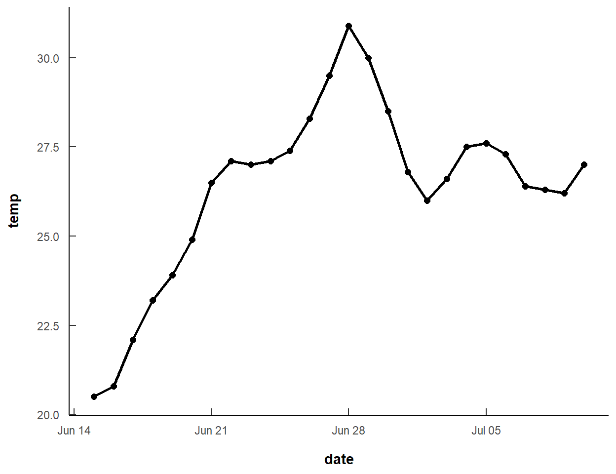
This basic plot needs to have proper axis labels, modified tick labels, and no range expansion on the y-axis. Modifications to the y-axis are easily made with scale_y_contuous(). Modifications to the x-axis are made with scale_x_date(). The x-axis scale was expanded by a constant two days (using add= in expansion()) at both ends to match Figure 3 of Clemens (2022). Breaks and their labeling were modified with breaks= and labels= as described in this post. In breaks_width() the interval for tick marks is set for every two days and the start of those tick marks is moved back (i.e., a negative number) three days to start on 13-Jun as in Figure 3 of Clemens (2022). The format for the date labels is set in label_date() to be the numeric day (%d) separated from the abbreviated month (%b) by a hyphen.
ggplot() +
  geom_line(data=dat,mapping=aes(x=date,y=temp),
            linewidth=1) +
  geom_point(data=dat,mapping=aes(x=date,y=temp),
             size=2) +
  scale_y_continuous(name="Mean daily temperature (degrees Celsius)",
                     expand=expansion(mult=0),
                     limits=c(18,32),breaks=seq(18,32,1)) +
  scale_x_date(name="Date",expand=expansion(add=2),
               breaks=breaks_width("2 days",offset="-3 days"),
               labels=label_date("%d-%b"))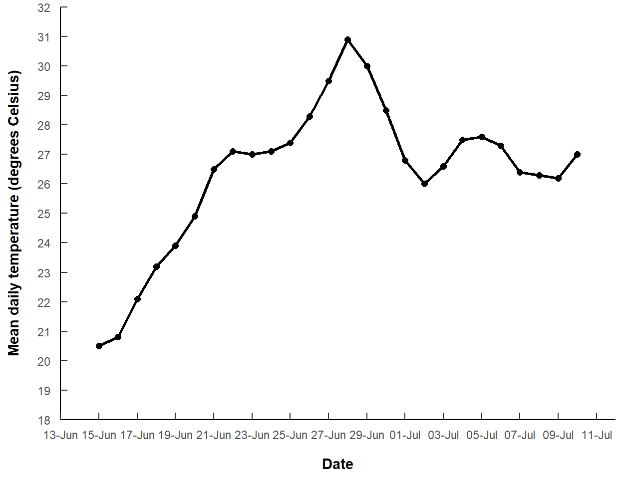
Adding Vertical Lines
The author noted a lamprey mortality on “30-Jun-2021” and another between “5-Jul-2021” and “8-Jul-2021”. These data are represented by the vertical lines in Figure 3, and I entered them into a vector below (making sure they were treated as dates).
morts <- as.Date(c("30-Jun-2021","5-Jul-2021","8-Jul-2021"),format=dfmt)The vertical lines at the mortality dates will be added with geom_segment(). geom_segment() requires an x= and y= coordinate for the start of the segment and an xend= and yend= coordinate for the end of the segment. Here we want each segment to start at one of the observed points and end at the x-axis, where there will be an arrow. The x-axis value can be found automatically with -Inf. A data frame with these values is created by first filtering the original data frame to just the mortality dates and then adding a yend variable that is -Inf for each date.
mdat <- dat |>
  filter(date %in% morts) |>
  mutate(yend=-Inf)
mdat
#R| date temp yend
#R| 1 2021-06-30 28.5 -Inf
#R| 2 2021-07-05 27.6 -Inf
#R| 3 2021-07-08 26.3 -InfWith this, three segments will extend from the x=date and y=temp points to the xend=date and yend=yend points.
ggplot() +
  geom_line(data=dat,mapping=aes(x=date,y=temp),
            linewidth=1) +
  geom_point(data=dat,mapping=aes(x=date,y=temp),
             size=2) +
  geom_segment(data=mdat,mapping=aes(x=date,y=temp,xend=date,yend=yend)) +
  scale_y_continuous(name="Mean daily temperature (degrees Celsius)",
                     expand=expansion(mult=0),
                     limits=c(18,32),breaks=seq(18,32,1)) +
  scale_x_date(name="Date",expand=expansion(add=2),
               breaks=breaks_width("2 days",offset="-3 days"),
               labels=label_date("%d-%b"))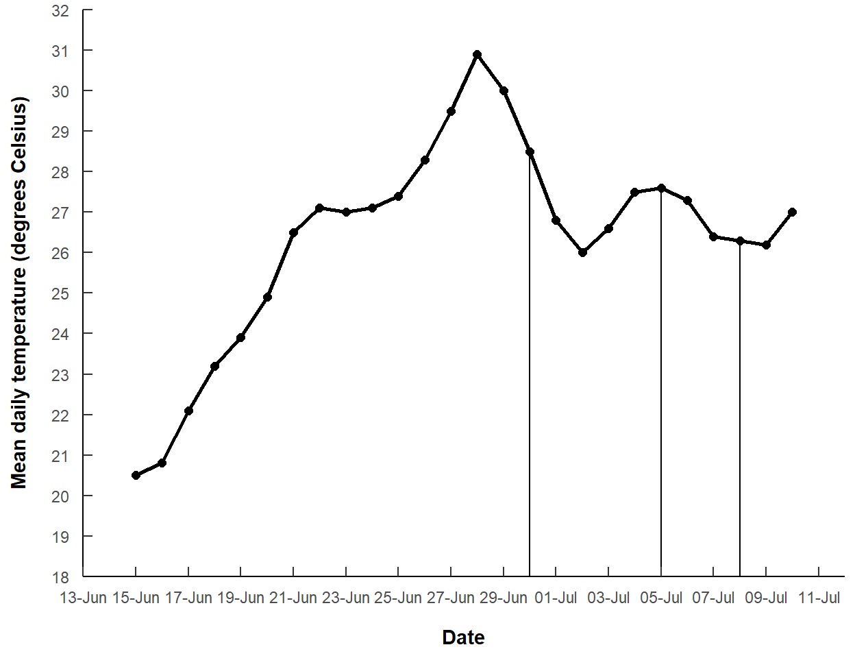
The segments can be changed to gray dashed lines with color= and linetype= and an arrow can be added to the end with arrow=arrow(). Here I made the arrow closed and smaller than the default.
ggplot() +
  geom_line(data=dat,mapping=aes(x=date,y=temp),
            linewidth=1) +
  geom_point(data=dat,mapping=aes(x=date,y=temp),
             size=2) +
  geom_segment(data=mdat,mapping=aes(x=date,y=temp,xend=date,yend=yend),
               linetype="dashed",linewidth=1,color="gray30",
               arrow=arrow(type="closed",length=unit(0.1,"inches"))) +
  scale_y_continuous(name="Mean daily temperature (degrees Celsius)",
                     expand=expansion(mult=0),
                     limits=c(18,32),breaks=seq(18,32,1)) +
  scale_x_date(name="Date",expand=expansion(add=2),
               breaks=breaks_width("2 days",offset="-3 days"),
               labels=label_date("%d-%b"))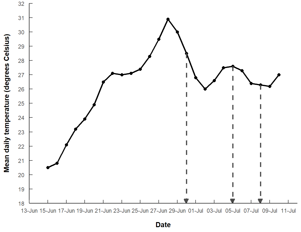
This largely recreates Figure 3 of Clemens (2022).
Further Thoughts
Shaded Region
The two July mortality dates are a range in which the mortality was thought to have happened. I thought it might be instructive to highlight the area between those two dates with geom_polygon().
geom_polyon() requires a data frame that contains the points (in order) for each “node” of the polygon. In this case, the data frame needs each observed point in the “5-Jul-2021” to “8-Jul-2021” range and the two points on the x-axis at those two dates. The filter() below extracts the rows from dat that are greater than or equal to “5-Jul-2021” and less than or equal to “8-Jul-2021”, which are stored in the second and third positions of morts created above. The bind_rows() line binds on the rows of a data frame that contains those two dates from morts, but in reverse order so that the points in the data frame are in order around the perimeter of the polygon, and -Inf for both temp values, indicating the points along the x-axis as above.
mdat2 <- dat |>
  filter(date>=morts[2],date<=morts[3]) |>
  bind_rows(data.frame(date=morts[3:2],
                       temp=c(-Inf,-Inf)))
mdat2
#R| date temp
#R| 1 2021-07-05 27.6
#R| 2 2021-07-06 27.3
#R| 3 2021-07-07 26.4
#R| 4 2021-07-08 26.3
#R| 5 2021-07-08 -Inf
#R| 6 2021-07-05 -Infgeom_polygon() with this data frame and using a fairly light gray color is then added to the previous plot, but before the other geom_s so that the shaded polygon sits behind the lines and points.
ggplot() +
  geom_polygon(data=mdat2,mapping=aes(x=date,y=temp),
               fill="gray90") +
  geom_line(data=dat,mapping=aes(x=date,y=temp),
            linewidth=1) +
  geom_point(data=dat,mapping=aes(x=date,y=temp),
             size=2) +
  geom_segment(data=mdat,mapping=aes(x=date,y=temp,xend=date,yend=yend),
               linetype="dashed",linewidth=1,color="gray30",
               arrow=arrow(type="closed",length=unit(0.1,"inches"))) +
  scale_y_continuous(name="Mean daily temperature (degrees Celsius)",
                     expand=expansion(mult=0),
                     limits=c(18,32),breaks=seq(18,32,1)) +
  scale_x_date(name="Date",expand=expansion(add=2),
               breaks=breaks_width("2 days",offset="-3 days"),
               labels=label_date("%d-%b"))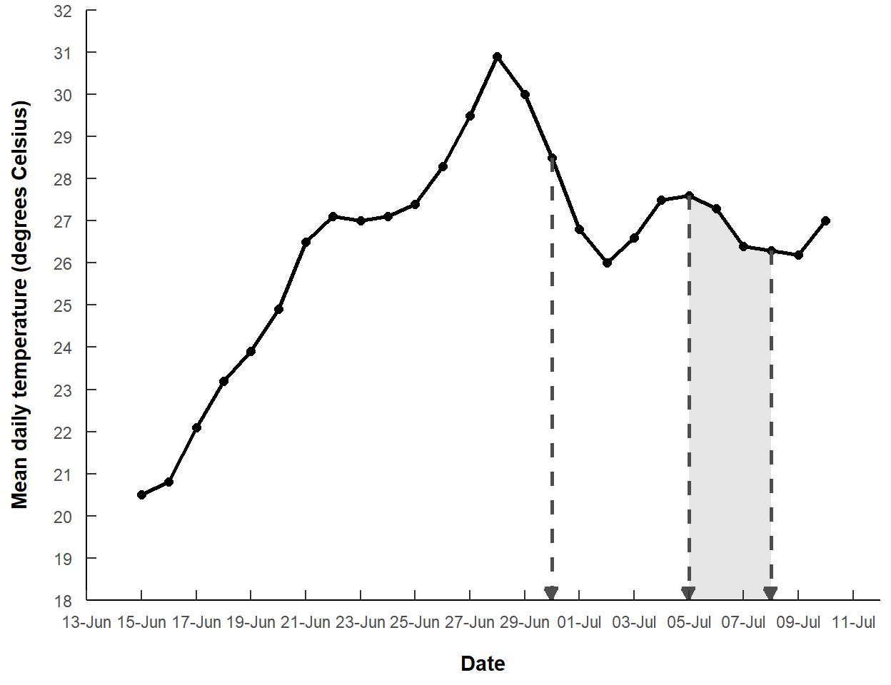
Degree Symbol
The y-axis label is a bit verbose, with “degrees” and “Celsius” both written out, rather than using “oC”. For some simple symbols, like the degree symbol, you can use a special “unicode”. For example, including \u00b0 in the name= argument to scale_y_continuous() will produce a degree symbol. With this, I also reduced “Celsius” to “C”.
ggplot() +
  geom_polygon(data=mdat2,mapping=aes(x=date,y=temp),
               fill="gray90") +
  geom_line(data=dat,mapping=aes(x=date,y=temp),
            linewidth=1) +
  geom_point(data=dat,mapping=aes(x=date,y=temp),
             size=2) +
  geom_segment(data=mdat,mapping=aes(x=date,y=temp,xend=date,yend=yend),
               linetype="dashed",linewidth=1,color="gray30",
               arrow=arrow(type="closed",length=unit(0.1,"inches"))) +
  scale_y_continuous(name="Mean daily temperature (\u00b0C)",
                     expand=expansion(mult=0),
                     limits=c(18,32),breaks=seq(18,32,1)) +
  scale_x_date(name="Date",expand=expansion(add=2),
               breaks=breaks_width("2 days",offset="-3 days"),
               labels=label_date("%d-%b"))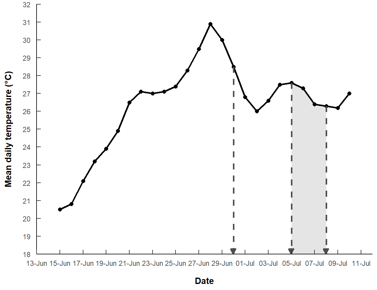
References
Clemens, B. J. 2022. Warmwater Temperatures (≥ 20°C) as a Threat to Pacific Lamprey: Implications of Climate Change. Journal of Fish and Wildlife Management 13(2):591–598.
Reuse
Citation
BibTeX citation:
@online{h._ogle2023,
  author = {H. Ogle, Derek},
  title = {Clemens (2022) {Temperature} {Figure}},
  date = {2023-03-09},
  url = {https://fishr-core-team.github.io/fishR/blog/posts/2023-3-9-Clemens2022/},
  langid = {en}
}
For attribution, please cite this work as:
H. Ogle, D. 2023, March 9. Clemens (2022) Temperature Figure. https://fishr-core-team.github.io/fishR/blog/posts/2023-3-9-Clemens2022/.