library(tidyverse)  # for dplyr, ggplot2 packages
library(scales)     # for breaks_width(), label_date()
library(lubridate) # for date handling functions ... month(), day()Introduction
Mack and Cheatwood (2022) examined the upstream movements of American Eel (Anguilla rostrata) at four dams from North Carolina to the New York and Canada border. Their Figure 2 shows the cumulative percentage catch of eels by day at each dam for ten years. They must have used ggplot2 to produce their figure as it was fairly straightforward to reproduce. However, doing so reveals a few “tricks of the trade”, which I demonstrate below.
Getting Setup
The following packages are loaded for use below. A single function from lemon is also used.1
1 That function will be accessed with :: so that the whole package is not attached.
The ggplot2 theme was set to theme_classic() but with modifications to more closely match the author’s choices (i.e., slightly larger and bolded axis tick labels and axis title, remove x-axis label, remove background color and outline from the facet labels (AKA “strip”s), and slight larger and bolded facet labels).
theme_set(
  theme_classic() +
    theme(axis.text=element_text(size=11,face="bold"),
          axis.title=element_text(size=12,face="bold"),
          axis.title.x=element_blank(),
          strip.background=element_blank(),
          strip.text=element_text(size=11,face="bold"))
)
Get Data
Mack and Cheatwood (2022) provided the raw data for their study as a supplementary CSV file. I had a bit of trouble downloading the file as the first “Supplemental Material” portion of the online manuscript linked to a ZIP file that contained a shapefile database rather than the data its description stated, and the second “Supplemental Material” portion of the online manuscript linked to a file called “Download” that appeared to be a CSV file and not the XLSX file that its description implied. Nevertheless, this second file seemed to contain the data of interest and is used here.
I loaded this file from my local directory, changed Location to a factor variable with the levels in the North-South order described in Mack and Cheatwood (2022), and changed the Date string variable to a proper date variable using as.Date() with the format code of "%m/%d/%Y", where %m indicates a numeric month, %d indicates a numeric day, and %Y indicates a four-digit year.2 Additionally, two variables not used in this post were removed and I made sure that the data were sorted by date within each location.3
2 I observed this format for their dates from an initial import of the data. Also see ?strptime for more date-time codes.
3 This sorting is required when computing the cumulative sum results next.
dat <- read.csv("Download") |>
  mutate(Location=case_when(
           Location=="RoanokeRapids" ~ "Roanoke Rapids",
           Location=="StLawrence" ~ "Moses-Saunders",
           TRUE ~ Location),
         Location=factor(Location,
                         levels=c("Moses-Saunders","Holyoke",
                                  "Conowingo","Roanoke Rapids")),
         Date=as.Date(Date,format="%m/%d/%Y")) |>
  select(-EelsPerDay,-Peak) |>
  arrange(Location,Year)

FSA::headtail(dat)
#R| Location Year Date Eels
#R| 1 Moses-Saunders 2012 2012-06-16 50
#R| 2 Moses-Saunders 2012 2012-06-17 120
#R| 3 Moses-Saunders 2012 2012-06-18 195
#R| 4304 Roanoke Rapids 2019 2019-11-27 4
#R| 4305 Roanoke Rapids 2019 2019-11-29 8
#R| 4306 Roanoke Rapids 2019 2019-12-02 1In Figure 2 the authors plotted percent cumulative catch of Eels against date for each year and location. The cumulative sum by date of Eels is found with cumsum() as long as the data are ordered by date as done above. The percentage cumulative sum is then calculated by dividing each cumulative sum value by the maximum cumulative sum value (i.e., the total of Eels caught). These two calculations must be done separately for each year within each location, so the data are grouped by Location and then Year before making the calculations.4
4 Make sure to ungroup() after the calculations before moving on.
dat <- dat |>
  group_by(Location,Year) |>
  mutate(cumsumEels=cumsum(Eels),
         pcumsumEels=cumsumEels/max(cumsumEels)*100) |>
  ungroup()

FSA::headtail(dat)
#R| Location Year Date Eels cumsumEels pcumsumEels
#R| 1 Moses-Saunders 2012 2012-06-16 50 50 0.1016839
#R| 2 Moses-Saunders 2012 2012-06-17 120 170 0.3457252
#R| 3 Moses-Saunders 2012 2012-06-18 195 365 0.7422924
#R| 4304 Roanoke Rapids 2019 2019-11-27 4 37719 99.9761450
#R| 4305 Roanoke Rapids 2019 2019-11-29 8 37727 99.9973494
#R| 4306 Roanoke Rapids 2019 2019-12-02 1 37728 100.0000000Figure 2 plotted all years of data to a common x-axis of date within a year. To facilitate this, a “Date” variable is needed that is the month and day from the observed Date but with a common (and, thus, constant) year. This constant year could be any year, as long as it is consistent. I chose a common year of 2000, which is outside the range of the observed years so as to be less confusing. This new “Date” variable is constructed below by extracting the month and day from Date with month() and day, pasting these together with a year of 2000 and with forward slashes, and then converting to a proper date with as.Date().
dat <- dat |>
  mutate(Date2=as.Date(paste0(month(Date),"/",
                              day(Date),"/",
                              "2000"),
                              format="%m/%d/%Y"))

FSA::headtail(dat)
#R| Location Year Date Eels cumsumEels pcumsumEels Date2
#R| 1 Moses-Saunders 2012 2012-06-16 50 50 0.1016839 2000-06-16
#R| 2 Moses-Saunders 2012 2012-06-17 120 170 0.3457252 2000-06-17
#R| 3 Moses-Saunders 2012 2012-06-18 195 365 0.7422924 2000-06-18
#R| 4304 Roanoke Rapids 2019 2019-11-27 4 37719 99.9761450 2000-11-27
#R| 4305 Roanoke Rapids 2019 2019-11-29 8 37727 99.9973494 2000-11-29
#R| 4306 Roanoke Rapids 2019 2019-12-02 1 37728 100.0000000 2000-12-02
Recreating Figure 2
One Location
For illustrative purposes I first constructed just the Roanoke Rapids subpanel of Figure 2.
datRR <- dat |>
  filter(Location=="Roanoke Rapids")
The foundation of the figure is constructed by mapping Date2 to the x-axis and pcumsumEels to the y-axis, mapping Year to group= to get separate lines for each year, and then using geom_line(). I increased the line width slightly to better match the authors’ choice.
ggplot(data=datRR,mapping=aes(x=Date2,y=pcumsumEels,group=Year)) +
  geom_line(linewidth=1)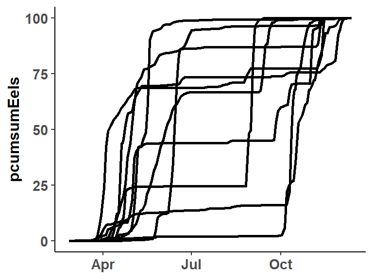
The x-axis labels need to be modified to be monthly, which is accomplished with breaks=breaks_width("month") within scale_x_date(). By default these labels will appear numeric with the month, day, and year. However, just the abbreviated month name can be used by including labels=label_date("%b%).5
5 %b is a code the identifies the month name abbreviation. See this post.
ggplot(data=datRR,mapping=aes(x=Date2,y=pcumsumEels,group=Year)) +
  geom_line(linewidth=1) +
  scale_x_date(breaks=breaks_width("month"),labels=label_date("%b")) +
  scale_y_continuous(name="Cumulative Percentage of Eels Captured")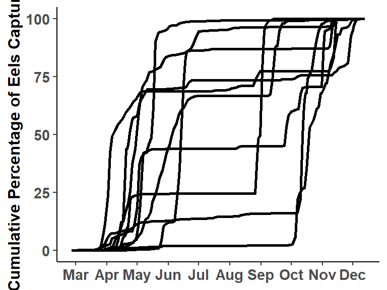
All Locations
The plot for one location can be expanded to a plot for all locations by first changing the data to the data frame that has all locations and then “faceting” with respect to Location.
ggplot(data=dat,mapping=aes(x=Date2,y=pcumsumEels,group=Year)) +
  geom_line(linewidth=1) +
  scale_x_date(breaks=breaks_width("month"),labels=label_date("%b")) +
  scale_y_continuous(name="Cumulative Percentage of Eels Captured") +
  facet_wrap(vars(Location))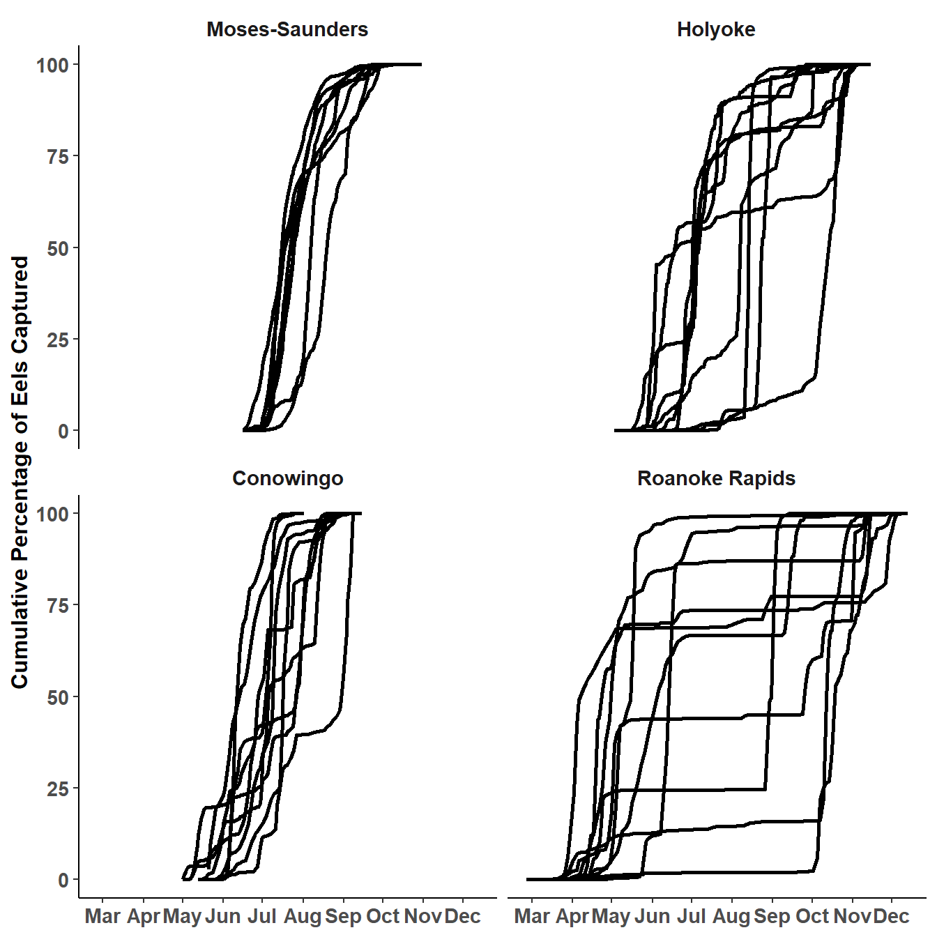
The subpanels can be “stacked” by forcing the faceting to be in one column with ncol=. In addition, the “facet” (or “strip”) labels can be moved from the default position with strip.position=.
ggplot(data=dat,mapping=aes(x=Date2,y=pcumsumEels,group=Year)) +
  geom_line(linewidth=1) +
  scale_x_date(breaks=breaks_width("month"),labels=label_date("%b")) +
  scale_y_continuous(name="Cumulative Percentage of Eels Captured") +
  facet_wrap(vars(Location),
             ncol=1,strip.position="left")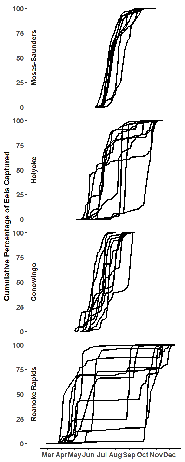
This is very close to Figure 2 in Mack and Cheatwood (2022) but they had an x-axis with tick marks for each facet. I initially tried to accomplish this with scales="free_x" in facet_wrap() but this also included the month labels for each facet. The only way I could accomplish what the authors did was to use facet_rep_wrap() from the lemon package, which for this purpose has the same arguments as facet_wrap().
ggplot(data=dat,mapping=aes(x=Date2,y=pcumsumEels,group=Year)) +
  geom_line(linewidth=1) +
  scale_x_date(breaks=breaks_width("month"),labels=label_date("%b")) +
  scale_y_continuous(name="Cumulative Percentage of Eels Captured") +
  lemon::facet_rep_wrap(vars(Location),
                        ncol=1,strip.position="left")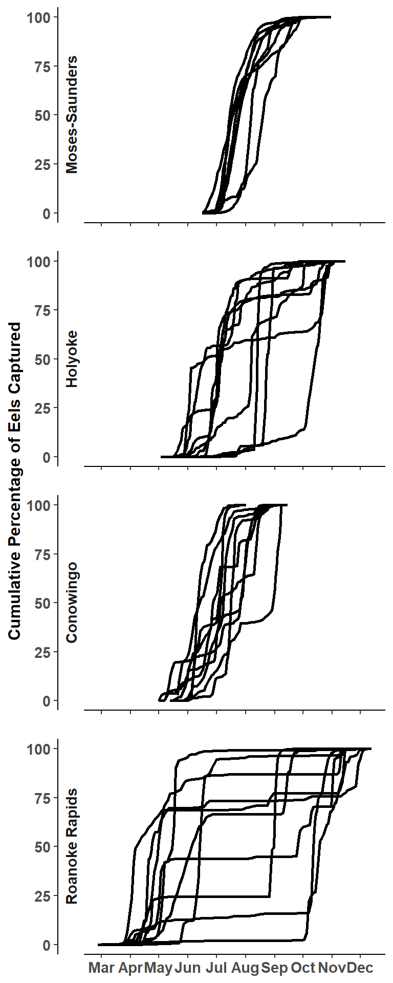
Further Thoughts
geom_step()
It is fairly common to show cumulative distributions with “steps” rather than lines. This is easily accomplished by replacing geom_line() with geom_step(). I don’t think that using steps is necessarily “better” with these data.
ggplot(data=datRR,mapping=aes(x=Date2,y=pcumsumEels,group=Year)) +
  geom_step(linewidth=1) +
  scale_x_date(breaks=breaks_width("month"),labels=label_date("%b")) +
  scale_y_continuous(name="Cumulative Percentage of Eels Captured")
Explore Year Effects
Mack and Cheatwood (2022) were not interested in describing specific year-to-year differences. However, I was curious if any patterns among years were visually evident. I initially examined this by coding years with color, but the plot is pretty messy.
ggplot(data=dat,mapping=aes(x=Date2,y=pcumsumEels,group=Year,color=Year)) +
  geom_line(linewidth=1) +
  scale_x_date(breaks=breaks_width("month"),labels=label_date("%b")) +
  scale_y_continuous(name="Cumulative Percentage of Eels Captured") +
  scale_color_viridis_c(begin=0.75,end=0.25,label=scales::label_number(1)) +
  lemon::facet_rep_wrap(vars(Location),
                        ncol=1,strip.position="left")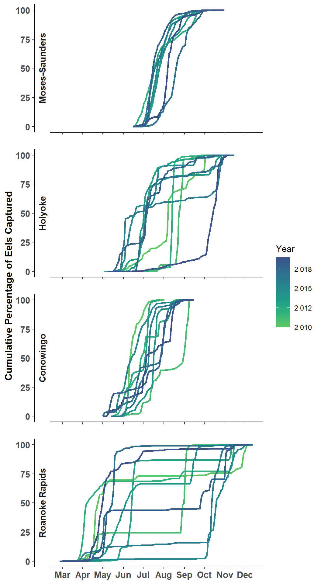
I then tried faceting by year and using color for location to see if there might be some obvious congruencies across locations within years. I don’t think this leads to a different narrative than what was evident in the authors’ Figure 2.
ggplot(data=dat,mapping=aes(x=Date2,y=pcumsumEels,group=Location,color=Location)) +
  geom_line(linewidth=1) +
  scale_x_date(breaks=breaks_width("2 months"),labels=label_date("%b")) +
  scale_y_continuous(name="Cumulative Percentage of Eels Captured") +
  scale_color_viridis_d(begin=0.9,end=0.1) +
  lemon::facet_rep_wrap(vars(Year),ncol=3)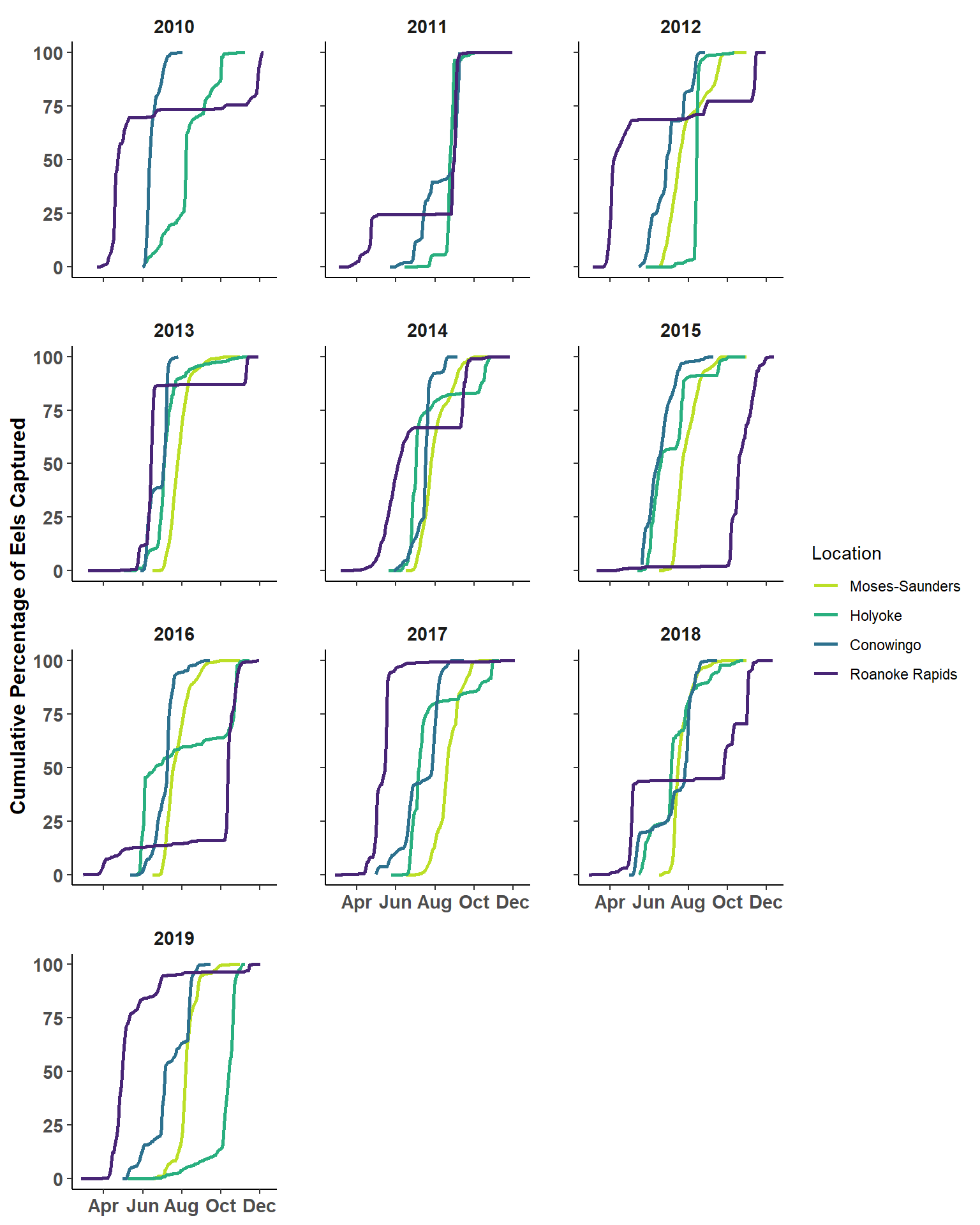
References
Mack, K., and T. Cheatwood. 2022. Generalizing trends in upstream american eel movements at four east coast hydropower projects. Journal of Fish and Wildlife Management 13(2):473–482.
Reuse
Citation
BibTeX citation:
@online{h._ogle2023,
  author = {H. Ogle, Derek},
  title = {Mack and {Cheatwood} (2022) {Cumulative} {Sums} {Figure}},
  date = {2023-03-08},
  url = {https://fishr-core-team.github.io/fishR/blog/posts/2023-3-8_MackCheatwood2022_CumSums/},
  langid = {en}
}
For attribution, please cite this work as:
H. Ogle, D. 2023, March 8. Mack and Cheatwood (2022) Cumulative Sums
Figure. https://fishr-core-team.github.io/fishR/blog/posts/2023-3-8_MackCheatwood2022_CumSums/.