library(tidyverse)  # for dplyr, ggplot2 packages
library(ggtext)     # for use of markdown in text/labels
Series Note
This is the second of several posts related to Miller et al. (2022). I thank the authors for making their data available with their publication.
Introduction
Miller et al. (2022) examined life history characteristics of Goldeye (Hiodon alosoides) in two Kansas reservoirs. Their Figure 2 and Figure 3 examined the length frequency and weight-length relationship of Goldeye captured in Milford Reservoir in 2020. I use ggplot2 here to recreate both figures.
The following packages are loaded for use below. A few functions from each of readxl, FSA, and scales are used with :: such that the entire packages are not attached here.
Data Wrangling
Miller et al. (2022) provided the raw data for producing Figures 2 and 3 in their Data Supplement S2, which I loaded below.
dat <- read.csv("JFWM-21-090.S2.csv")
head(dat,n=8)
#R| netid tl w agecap ann bclen
#R| 1 6 385 521 6 1 210
#R| 2 6 385 521 6 2 264
#R| 3 6 385 521 6 3 299
#R| 4 6 385 521 6 4 329
#R| 5 6 385 521 6 5 358
#R| 6 6 385 521 6 6 378
#R| 7 6 357 466 4 1 213
#R| 8 6 357 466 4 2 262The first six rows above all have the same tl, w, and age because these variables were repeated for each of the six observed annuli on this fish’s otoliths. To construct a proper length frequency and weight-length relationship, the data need to be reduced to only one observation of tl and w per fish. Thus, below, only records that corresponded to the first annulus are retained.
dat2 <- dat |>
  filter(ann==1)
head(dat2)
#R| netid tl w agecap ann bclen
#R| 1 6 385 521 6 1 210
#R| 2 6 357 466 4 1 213
#R| 3 6 397 725 5 1 209
#R| 4 8 393 610 8 1 202
#R| 5 8 373 571 4 1 193
#R| 6 8 389 656 6 1 163Total length of these fish was summarized below.
sumtl <- dat2 |>
  summarize(n=n(),
            mdnTL=median(tl,na.rm=TRUE),
            minTL=min(tl,na.rm=TRUE),
            maxTL=max(tl,na.rm=TRUE))
sumtl
#R| n mdnTL minTL maxTL
#R| 1 152 268 235 431These results match the summary results in the paragraph above Figure 2 in Miller et al. (2022). These data are ready to recreate Figures 2 and 3.
Recreating Figure 2
Figure 2 is a histogram of total length, which can be created with geom_histogram() with tl mapped to the x-axis. Bin widths of 10 mm that started on 0 mm and were closed on the left, as is typical for most fisheries applications, were used.1 It is difficult to discern what the authors did with respect to these arguments but my result is at least close to theirs.2
1 Making histograms in ggplot2 was discussed in detail in this post.
2 Curiously all of their bars seem shifted left by about 5 mm; this is most noticeable at 350 mm.
3 Adding labels such as these was discussed in more detail in this post.
To try to match the authors’ other choices I named, set limits, and defined breaks for both axes; removed the lower expansion for the y-axis so the bars did not hover about the x-axis and reduced the other expansion factors for both axes; applied the black-and-white theme; increased the font size and bolded the axis titles and tick mark labels; changed the tick mark labels to black; and used annotate() to add the sample size label in the upper-left corner.3
ggplot(data=dat2,mapping=aes(x=tl)) +
  geom_histogram(binwidth=10,boundary=0,closed="left") +
  scale_y_continuous(name="Count",
                     limits=c(0,50),breaks=scales::breaks_width(10),
                     expand=expansion(mult=c(0,0.01))) +
  scale_x_continuous(name="Total Length (mm)",limits=c(200,450),
                     breaks=scales::breaks_width(50),
                     expand=expansion(mult=0.02)) +
  theme_bw() +
  theme(panel.grid=element_blank(),
        axis.title=element_text(size=12,face="bold"),
        axis.text=element_text(size=10,face="bold",color="black")) +
  annotate(geom="text",label=paste("N =",sumtl$n),x=-Inf,y=Inf,vjust=1.5,hjust=-0.2,
           size=12/.pt,fontface="bold")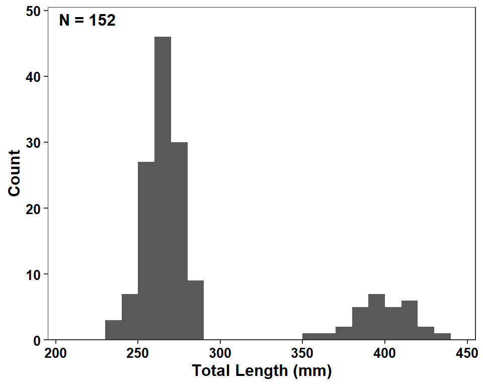
Possible Modifications
I find the use of a solid fill color with no delineation of the actual bars to be difficult on the eyes. I personally like to outline the bars with color="black" and then fill the bars with fill= set to some version of gray in geom_histogram().
ggplot(data=dat2,mapping=aes(x=tl)) +
  geom_histogram(binwidth=10,boundary=0,closed="left",
                 color="black",fill="gray60") +
  scale_y_continuous(name="Count",
                     limits=c(0,50),breaks=scales::breaks_width(10),
                     expand=expansion(mult=c(0,0.01))) +
  scale_x_continuous(name="Total Length (mm)",limits=c(200,450),
                     breaks=scales::breaks_width(50),
                     expand=expansion(mult=0.02)) +
  theme_bw() +
  theme(panel.grid=element_blank(),
        axis.title=element_text(size=12,face="bold"),
        axis.text=element_text(size=10,face="bold",color="black")) +
  annotate(geom="text",label=paste("N =",sumtl$n),x=-Inf,y=Inf,vjust=1.5,hjust=-0.2,
           size=12/.pt,fontface="bold")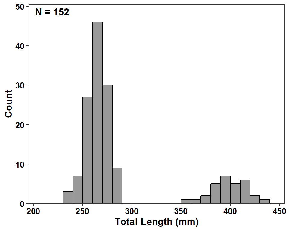
If you really like the dark fill then I would outline the bars with a lighter color.
ggplot(data=dat2,mapping=aes(x=tl)) +
  geom_histogram(binwidth=10,boundary=0,closed="left",
                 color="gray60",fill="gray20") +
  scale_y_continuous(name="Count",
                     limits=c(0,50),breaks=scales::breaks_width(10),
                     expand=expansion(mult=c(0,0.01))) +
  scale_x_continuous(name="Total Length (mm)",limits=c(200,450),
                     breaks=scales::breaks_width(50),
                     expand=expansion(mult=0.02)) +
  theme_bw() +
  theme(panel.grid=element_blank(),
        axis.title=element_text(size=12,face="bold"),
        axis.text=element_text(size=10,face="bold",color="black")) +
  annotate(geom="text",label=paste("N =",sumtl$n),x=-Inf,y=Inf,vjust=1.5,hjust=-0.2,
           size=12/.pt,fontface="bold")
Recreating Figure 3
Figure 3 is a scatterplot of weight versus length, with a best-fit regression line overlaid. The authors used a log-scale for both axes rather than plotting the log-transformed data. The basic scatterplot is constructed with geom_point() with the appropriate variables mapped to their respective axes. The authors used points that were outlined in black and semi-transparent in the middle. Circles with separate outline and fill colors are made with shape=21, with the outline color in color= and the fill color in fill=. col2rgbt() from FSA adds a transparency value (the second argument) to a named color.
ggplot(data=dat2,mapping=aes(x=tl,y=w)) +
  geom_point(shape=21,color="black",fill=FSA::col2rgbt("black",0.5)) +
  theme_bw() +
  theme(panel.grid=element_blank(),
        axis.title=element_text(size=12,face="bold"),
        axis.text=element_text(size=10,face="bold",color="black"))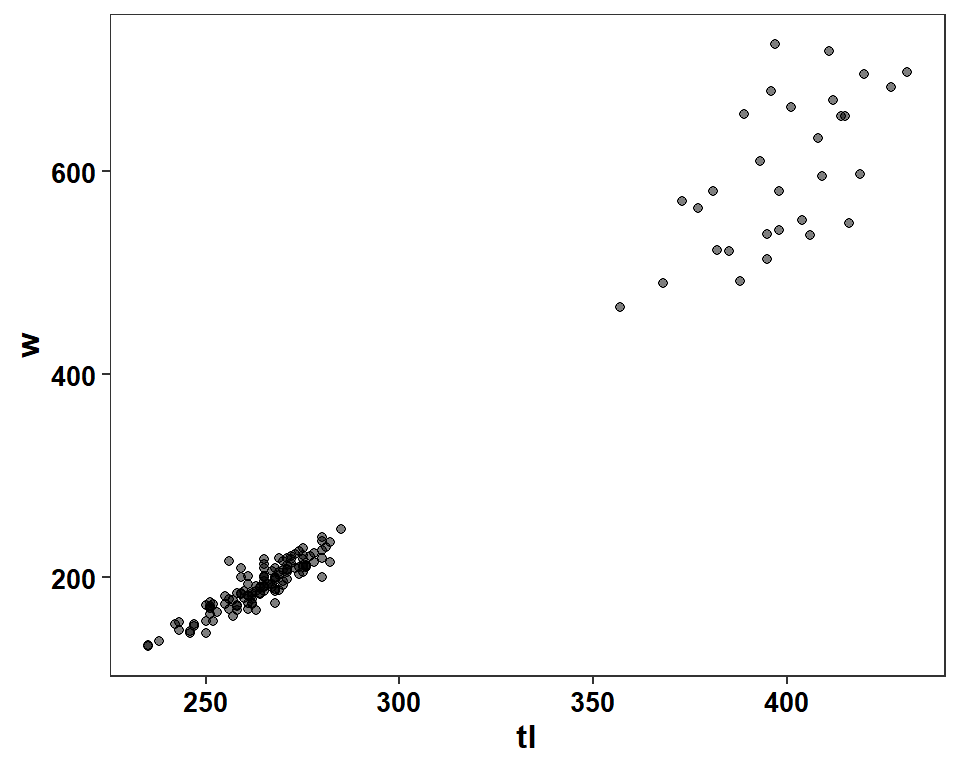
Log-scales can be created in a variety of ways, but I prefer to use trans=log10 in scale_(x|y)_continuous().
ggplot(data=dat2,mapping=aes(x=tl,y=w)) +
  geom_point(shape=21,color="black",fill=FSA::col2rgbt("black",0.5)) +
  scale_x_continuous(name="Total Length (mm)",trans="log10",
                     limits=c(220,440),breaks=scales::breaks_width(20),
                     expand=expansion(mult=0.02)) +
  scale_y_continuous(name="Mass (g)",trans="log10",
                     limits=c(100,800),breaks=scales::breaks_width(100),
                     expand=expansion(mult=0.02)) +
  theme_bw() +
  theme(panel.grid=element_blank(),
        axis.title=element_text(size=12,face="bold"),
        axis.text=element_text(size=10,face="bold",color="black"))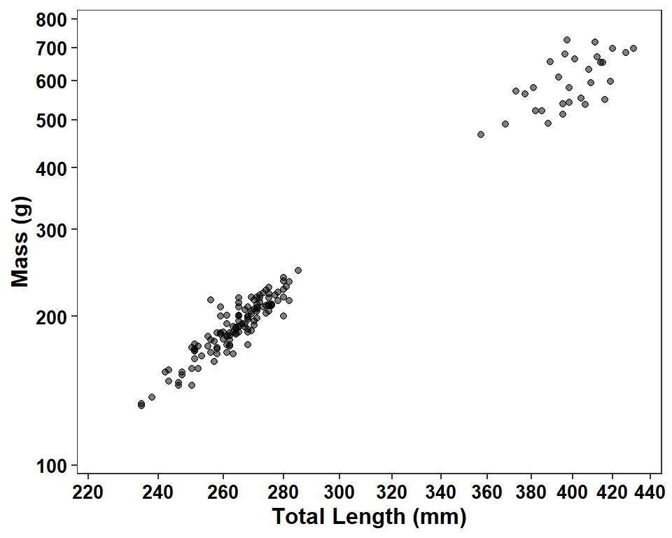
The linear regression line is added with geom_smooth() using method="lm",4 se=FALSE to suppress showing the confidence band, and color="black" to show the line in black.5 Because trans="log10" was used for both scales, the regression will be performed with log-transformed lengths and weights.
4 The default is to use a loess model.
5 The default is blue.
ggplot(data=dat2,mapping=aes(x=tl,y=w)) +
  geom_smooth(method="lm",se=FALSE,color="black") +
  geom_point() +
  scale_x_continuous(name="Total Length (mm)",trans="log10",
                     limits=c(220,440),breaks=scales::breaks_width(20),
                     expand=expansion(mult=0.02)) +
  scale_y_continuous(name="Mass (g)",trans="log10",
                     limits=c(100,800),breaks=scales::breaks_width(100),
                     expand=expansion(mult=0.02)) +
  theme_bw() +
  theme(panel.grid=element_blank(),
        axis.title=element_text(size=12,face="bold"),
        axis.text=element_text(size=10,face="bold",color="black"))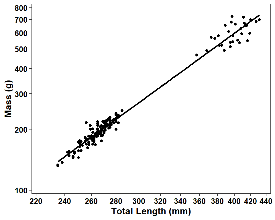
Creating the regression results labels is similar to that shown in this previous post. The regression must be performed on the log-log scale and, thus, variables for the log of weight and length are added to the data frame.
dat2 <- dat2 |>
  mutate(logtl=log10(tl),
         logw=log10(w))
The regression is then fit and the summarized results saved to an object called tmp. The r2, intercept (stored in b), and slope (in m) are extracted and assigned to objects. Each was rounded to two decimals to match the authors’ choices.
tmp <- summary(lm(logw~logtl,data=dat2))
( r2 <- round(tmp$r.squared,2) )
#R| [1] 0.98( b <- round(tmp$coefficients["(Intercept)","Estimate"],2) )#R| [1] -4.38( m <- round(tmp$coefficients["logtl","Estimate"],2) )#R| [1] 2.75These results are then turned into labels using markdown language code. Recall that text wrapped in * or <emph>will be italicized, text wrapped in ^ or <sup> will be superscripted, and text wrapped in ~ or <sub> will be subscripted.6 The × is specific code to produce the × symbol. paste0 pastes text together with no separation between the provided parts.
6 I had inconsistent problems using ^ in the equation so I used <sup> here.
r2 <- paste0("*r*^2^ = ",r2)
eqn1 <- paste0("Mass = 10<sup>(",b,"+",m,"×log~10~TL)</sup>")These labels are then added to the plot with annotate() using geom="richtext" so that the markdown language code will be rendered appropriately. Note that Inf does not work well with trans="log10" so the x= and y= coordinates had to be specified.
ggplot(data=dat2,mapping=aes(x=tl,y=w)) +
  geom_smooth(method="lm",se=FALSE,color="black") +
  geom_point() +
  scale_x_continuous(name="Total Length (mm)",trans="log10",
                     limits=c(220,440),breaks=scales::breaks_width(20),
                     expand=expansion(mult=0.02)) +
  scale_y_continuous(name="Mass (g)",trans="log10",
                     limits=c(100,800),breaks=scales::breaks_width(100),
                     expand=expansion(mult=0.02)) +
  theme_bw() +
  theme(panel.grid=element_blank(),
        axis.title=element_text(size=12,face="bold"),
        axis.text=element_text(size=10,face="bold",color="black")) +
  annotate(geom="richtext",x=220,y=800,vjust=1,hjust=0,label=r2,
           label.color=NA,fontface="bold") +
  annotate(geom="richtext",x=220,y=800,vjust=2,hjust=0,label=eqn1,
           label.color=NA,fontface="bold")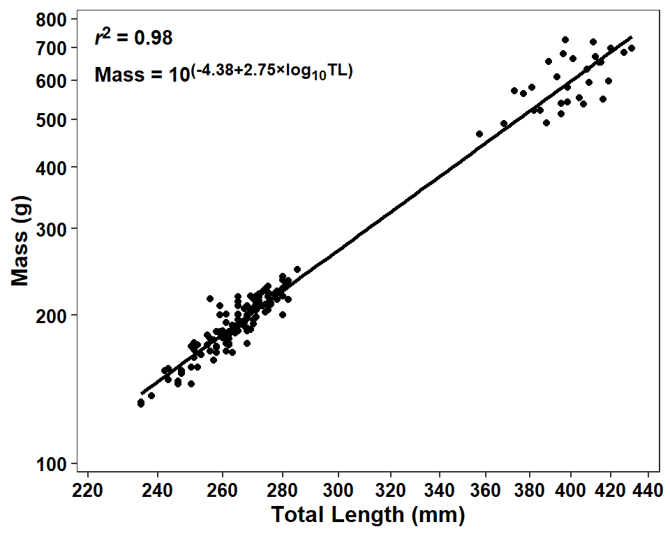
Possible Modifications
The equation of the regression is presented oddly in the sense that the left-hand-side is on the original mass scale but the right-hand-side shows log-transformed length but has that in a superscript of 10 suggesting a back-transformation to the original scale. If the actual values of the intercept and slope on the transformed scale are important for some reason then I suggest showing the results as a fully-transformed (linear) model. However, if the idea is to show the power function on the original scale then I suggest fully back-transforming the right-hand-side. Below I show this second option. Note that formatC() is used with format="f" so that the back-transformed intercept is not presented in scientific notation.
( bb <- formatC(10^(tmp$coefficients["(Intercept)","Estimate"]),format="f",digits=6))#R| [1] "0.000041"eqn2 <- paste0("Mass = ",bb,"TL<sup>",m,"</sup>")It is not really that important, but it seems odd to me to have the r2 above the model equation. Thus, I switched these two below.
ggplot(data=dat2,mapping=aes(x=tl,y=w)) +
  geom_smooth(method="lm",se=FALSE,color="black") +
  geom_point() +
  scale_x_continuous(name="Total Length (mm)",trans="log10",
                     limits=c(220,440),breaks=scales::breaks_width(20),
                     expand=expansion(mult=0.02)) +
  scale_y_continuous(name="Mass (g)",trans="log10",
                     limits=c(100,800),breaks=scales::breaks_width(100),
                     expand=expansion(mult=0.02)) +
  theme_bw() +
  theme(panel.grid=element_blank(),
        axis.title=element_text(size=12,face="bold"),
        axis.text=element_text(size=10,face="bold",color="black")) +
  annotate(geom="richtext",x=220,y=800,vjust=1,hjust=0,label=eqn2,
           label.color=NA,fontface="bold") +
  annotate(geom="richtext",x=220,y=800,vjust=2,hjust=0,label=r2,
           label.color=NA,fontface="bold")
The authors presented a confidence band in their Figure 5 and I showed how to add one to their Figure 1 in this post. As I said there, for the purposes of consistency I would add a confidence band to this plot as well by simply removing se=FALSE from geom_smooth().7
7 The regression line is so strong that the confidence band is barely noticeable.
ggplot(data=dat2,mapping=aes(x=tl,y=w)) +
  geom_smooth(method="lm",color="black") +
  geom_point() +
  scale_x_continuous(name="Total Length (mm)",trans="log10",
                     limits=c(220,440),breaks=scales::breaks_width(20),
                     expand=expansion(mult=0.02)) +
  scale_y_continuous(name="Mass (g)",trans="log10",
                     limits=c(100,800),breaks=scales::breaks_width(100),
                     expand=expansion(mult=0.02)) +
  theme_bw() +
  theme(panel.grid=element_blank(),
        axis.title=element_text(size=12,face="bold"),
        axis.text=element_text(size=10,face="bold",color="black")) +
  annotate(geom="richtext",x=220,y=800,vjust=1,hjust=0,label=eqn2,
           label.color=NA,fontface="bold") +
  annotate(geom="richtext",x=220,y=800,vjust=2,hjust=0,label=r2,
           label.color=NA,fontface="bold")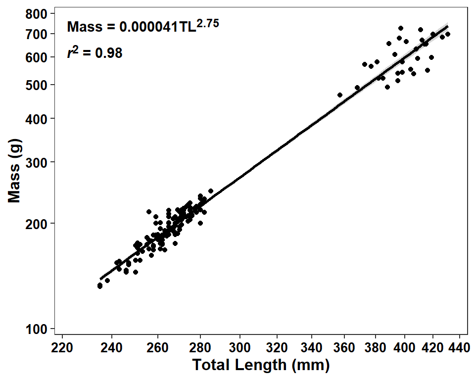
References
Miller, B. T., E. Flores, D. S. Waters, and B. C. Neely. 2022. An evaluation of Goldeye life history characteristics in two Kansas reservoirs. Journal of Fish and Wildlife Management 13(1):243–249.
Reuse
Citation
BibTeX citation:
@online{h._ogle2023,
  author = {H. Ogle, Derek},
  title = {Miller Et Al. (2022) {Size} {Plots}},
  date = {2023-03-31},
  url = {https://fishr-core-team.github.io/fishR/blog/posts/2023-3-31_Milleretal2022_Fig23/},
  langid = {en}
}
For attribution, please cite this work as:
H. Ogle, D. 2023, March 31. Miller et al. (2022) Size Plots. https://fishr-core-team.github.io/fishR/blog/posts/2023-3-31_Milleretal2022_Fig23/.