library(FSA)          ## for peek(), vbFuns(), vbStarts(), SpotVA1
library(dplyr)        ## for mutate()
library(ggplot2)
library(patchwork)    ## placing plots (in conclusion)
theme_set(theme_bw())
Note
The following packages are loaded for use below. One function from nlstools is also used but the entire package is not loaded here. I also set the default ggplot theme to theme_bw() for a classic “black-and-white” plot (rather than the default plot with a gray background).
Warning
Some functions illustrated below were in the FSA package but have now been removed and put into the non-released FSAmisc package that I maintain. These functions are used below only to show what could be done in older versions of FSA but should now be done as described in this post. DO NOT USE any of the functions below that begin with FSAmisc::.
Introduction
We deprecated residPlot() from FSA v0.9.0 and fully removed it by the start of 2022. We took this action to make FSA more focused on fisheries applications and to eliminate “black box” functions. residPlot() was originally designed for students to quickly visualize residuals from one- and two-way ANOVAs and simple, indicator variable, and logistic regressions.1 We now feel that students are better served by learning how to create these visualizations using methods provided by ggplot2, which require more code, but are more modern, flexible, and transparent.
1 Over time functionality for non-linear regressions was added.
The basic plots produced by residPlot() are recreated here using ggplot2 to provide a resource to help users that relied on residPlot() transition to ggplot2.
Example Data
Most examples below use the Mirex data set from FSA, which contains the concentration of mirex in the tissue and the body weight of two species of salmon (chinook and coho) captured in six years. The year variable is converted to a factor for modeling purposes and a new variable is created that indicates if the mirex concentration was greater that 0.2 or not. These same data were used in this post about removing fitPlot() from FSA.2
2 peek() from FSA is used to examine a portion of the data from evenly-spaced row.
data(Mirex,package="FSA")
Mirex <- Mirex |>
  mutate(year=factor(year),
         gt2=ifelse(mirex>0.2,1,0))
peek(Mirex,n=10)
#R| year weight mirex species gt2
#R| 1 1977 0.41 0.16 chinook 0
#R| 14 1977 3.29 0.23 coho 1
#R| 27 1982 0.70 0.10 coho 0
#R| 41 1982 5.09 0.27 coho 1
#R| 54 1986 1.82 0.12 chinook 0
#R| 68 1986 8.40 0.13 chinook 0
#R| 81 1992 10.00 0.48 chinook 1
#R| 95 1996 5.70 0.16 coho 0
#R| 108 1999 5.11 0.11 coho 0
#R| 122 1999 11.82 0.09 chinook 0
One-Way ANOVA
The code below fits a one-way ANOVA model to examine if mean weight differs by species.
aov1 <- lm(weight~species,data=Mirex)
anova(aov1)
#R| Analysis of Variance Table
#R|
#R| Response: weight
#R| Df Sum Sq Mean Sq F value Pr(>F)
#R| species 1 282.4 282.399 27.657 6.404e-07 ***
#R| Residuals 120 1225.3 10.211
#R| ---
#R| Signif. codes: 0 '***' 0.001 '**' 0.01 '*' 0.05 '.' 0.1 ' ' 1
residPlot() from FSA produced a boxplot of residuals by group (left) and a histogram of residuals (right).
FSAmisc::residPlot(aov1)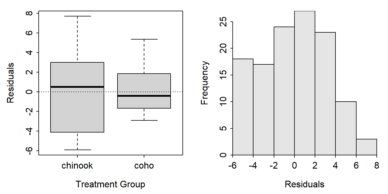
A data frame of the two variables used in the ANOVA appended with the fitted values and residuals from the model fit must be made to construct this plot using ggplot(). Studentized residuals are included below in case you would prefer to plot them.3
3 These are “internally” Studentized residuals. “Externally” Studentized residuals can be obtained with rstandard().
tmp <- Mirex |>
  select(weight,species) |>
  mutate(fits=fitted(aov1),
         resids=resid(aov1),
         sresids=rstudent(aov1))
peek(tmp,n=8)
#R| weight species fits resids sresids
#R| 1 0.41 chinook 6.314776 -5.9047761 -1.8814369
#R| 17 4.77 coho 3.257091 1.5129091 0.4762846
#R| 35 2.92 chinook 6.314776 -3.3947761 -1.0710643
#R| 52 1.70 coho 3.257091 -1.5570909 -0.4902213
#R| 70 9.53 chinook 6.314776 3.2152239 1.0139117
#R| 87 0.90 coho 3.257091 -2.3570909 -0.7430562
#R| 105 2.61 coho 3.257091 -0.6470909 -0.2035546
#R| 122 11.82 chinook 6.314776 5.5052239 1.7507263
The histogram of residuals is constructed with geom_histogram() below. Note that the color of the histogram bars are modified and the bin width is set to better control the number of bars in the histogram. Finally, the bottom multiplier for the y-axis is set to zero so that that histogram bars do not “hover” above the x-axis.
ggplot(data=tmp,mapping=aes(x=resids)) +
  geom_histogram(color="gray30",fill="gray70",binwidth=0.5) +
  scale_y_continuous(expand=expansion(mult=c(0,0.05)))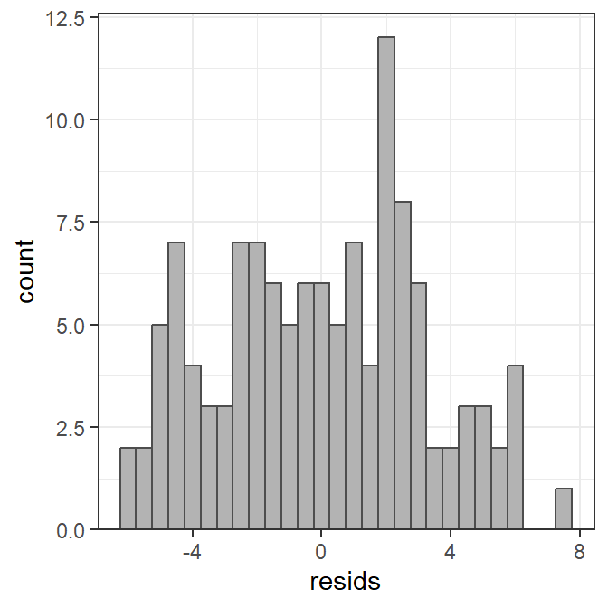
The boxplot of residuals by group (species in this case) is constructed with geom_boxplot() below (again controlling the colors of the boxplot).
ggplot(data=tmp,mapping=aes(x=species,y=resids)) +
  geom_boxplot(color="gray30",fill="gray70")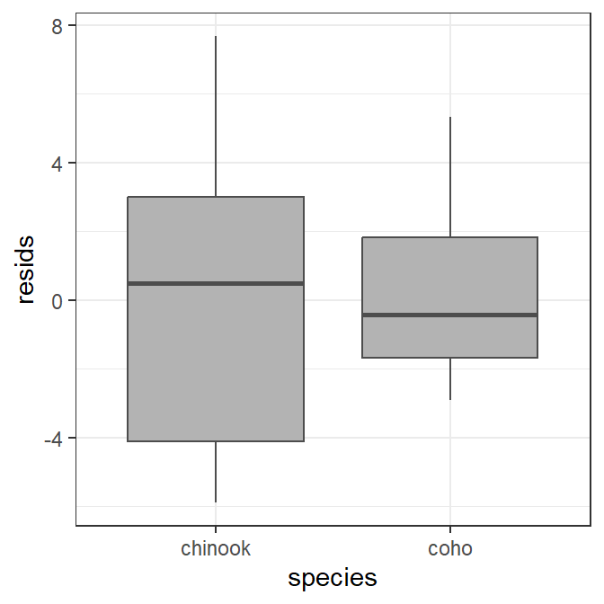
These plots can be further modified using methods typical for ggplot (see conclusion section).
Two-Way ANOVA
The code below fits a two-way ANOVA model to examine if mean weight differs by species, by year, or by the interaction between species and year.
aov2 <- lm(weight~year*species,data=Mirex)
anova(aov2)
#R| Analysis of Variance Table
#R|
#R| Response: weight
#R| Df Sum Sq Mean Sq F value Pr(>F)
#R| year 5 281.86 56.373 6.9954 1.039e-05 ***
#R| species 1 221.69 221.689 27.5099 7.648e-07 ***
#R| year:species 5 117.69 23.538 2.9208 0.01628 *
#R| Residuals 110 886.44 8.059
#R| ---
#R| Signif. codes: 0 '***' 0.001 '**' 0.01 '*' 0.05 '.' 0.1 ' ' 1
residPlot() from FSA showed a boxplot of residuals by each combination of the two factor variables (left) and a histogram of the residuals (right).
FSAmisc::residPlot(aov2)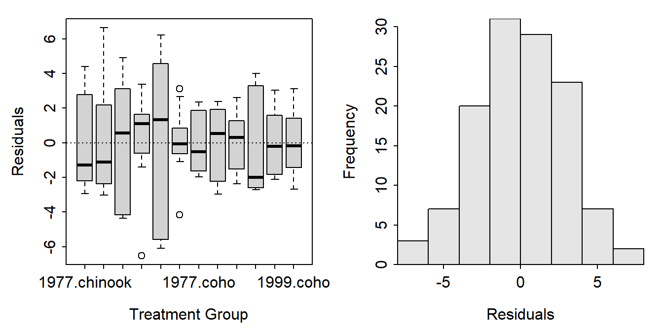
A data frame of the three variables used in the ANOVA appended with the fitted values and residuals from the model fit must be constructed.
tmp <- Mirex |>
  select(weight,species,year) |>
  mutate(fits=fitted(aov2),
         resids=resid(aov2),
         sresids=rstudent(aov2))
The histogram of residuals is constructed exactly as before and won’t be repeated here. The boxplot of residuals by group is constructed with one of the factor variables on the x-axis and the other factor variable as separate facets.4
4 These two variables can, of course, be exchanged. However, I generally prefer to have the variable with more levels on the x-axis.
ggplot(data=tmp,mapping=aes(x=year,y=resids)) +
  geom_boxplot(color="gray30",fill="gray70") +
  facet_wrap(vars(species))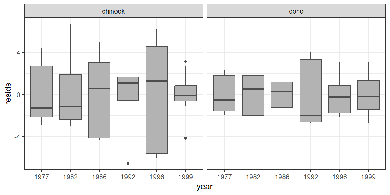
Simple Linear Regression
The code below fits a simple linear regression for examining the relationship between mirex concentration and salmon weight.
slr <- lm(mirex~weight,data=Mirex)
anova(slr)
#R| Analysis of Variance Table
#R|
#R| Response: mirex
#R| Df Sum Sq Mean Sq F value Pr(>F)
#R| weight 1 0.22298 0.222980 26.556 1.019e-06 ***
#R| Residuals 120 1.00758 0.008396
#R| ---
#R| Signif. codes: 0 '***' 0.001 '**' 0.01 '*' 0.05 '.' 0.1 ' ' 1
residPlot() from FSA showed a scatterplot of residuals versus fitted values (left) and a histogram of residuals (right).
FSAmisc::residPlot(slr)
A data frame of the two variables used in the ANOVA appended with the fitted values and residuals from the model fit must be constructed.
tmp <- Mirex |>
  select(weight,mirex) |>
  mutate(fits=fitted(slr),
         resids=resid(slr),
         sresids=rstudent(slr))
The histogram of residuals is constructed exactly as before and won’t be repeated here. The scatterplot of residuals versus fitted values is constructed with geom_point() as below. Note that geom_hline() is used to place the horizontal line at 0 on the y-axis.
ggplot(data=tmp,mapping=aes(x=fits,y=resids)) +
  geom_point() +
  geom_hline(yintercept=0,linetype="dashed")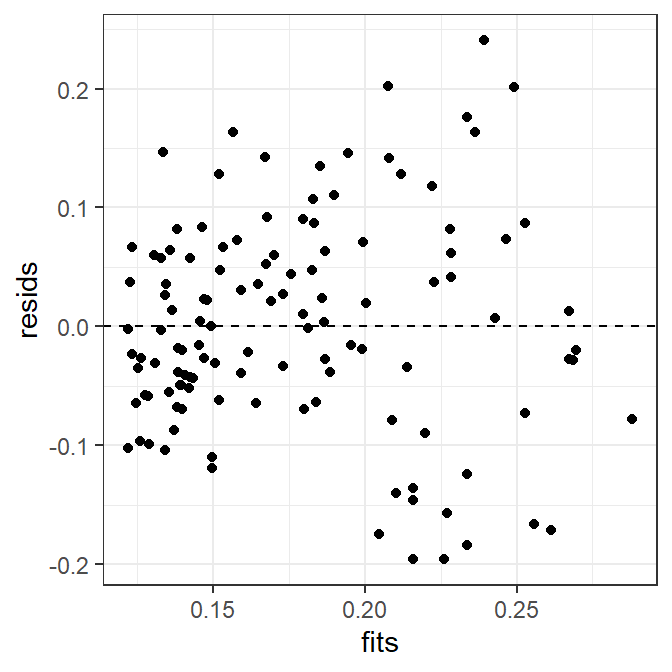
It is also possible to include a loess smoother to help identify a possible nonlinearity in this residual plot.
ggplot(data=tmp,mapping=aes(x=fits,y=resids)) +
  geom_point() +
  geom_hline(yintercept=0,linetype="dashed") +
  geom_smooth()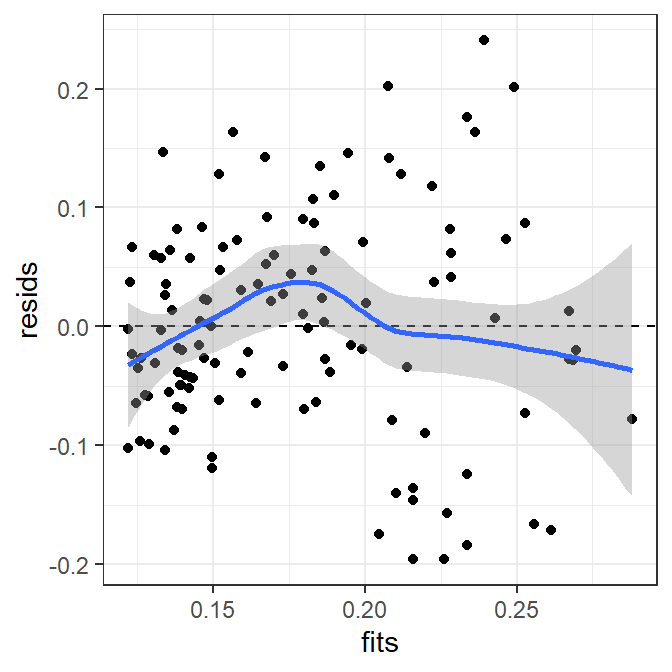
Indicator Variable Regression
The code below fits an indicator variable regression to examine if the relationship between mirex concentration and salmon weight differs betwen species.
ivr <- lm(mirex~weight*species,data=Mirex)
anova(ivr)
#R| Analysis of Variance Table
#R|
#R| Response: mirex
#R| Df Sum Sq Mean Sq F value Pr(>F)
#R| weight 1 0.22298 0.222980 26.8586 9.155e-07 ***
#R| species 1 0.00050 0.000498 0.0600 0.80690
#R| weight:species 1 0.02744 0.027444 3.3057 0.07158 .
#R| Residuals 118 0.97964 0.008302
#R| ---
#R| Signif. codes: 0 '***' 0.001 '**' 0.01 '*' 0.05 '.' 0.1 ' ' 1
residPlot() from FSA is the same for an IVR as for an SLR, except that the points on the residual plot (left) had different colors for the different groups.
FSAmisc::residPlot(ivr)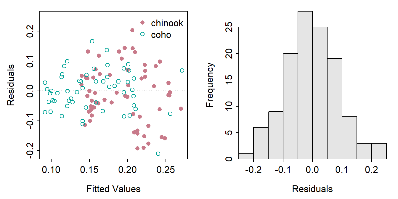
A data frame of the three variables used in the ANOVA appended with the fitted values and residuals from the model fit must be constructed.
tmp <- Mirex |>
  select(weight,mirex,species) |>
  mutate(fits=fitted(ivr),
         resids=resid(ivr),
         sresids=rstudent(ivr))
The histogram of residuals is constructed exactly as before and won’t be repeated here. The scatterplot of residuals versus fitted values is constructed with geom_point(). Note that color= and shape= are both set equal to the factor variable to change the color and plotting character to represent the different groups.
ggplot(data=tmp,mapping=aes(x=fits,y=resids,color=species,shape=species)) +
  geom_point() +
  geom_hline(yintercept=0,linetype="dashed")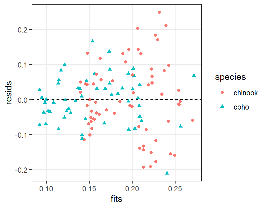
Nonlinear Regression
The following code fits a von Bertalanffy growth function (VBGF) to the total length and age data for spot found in the SpotVA1 data frame built into FSA. Fitting the VBGF is described in more detail here.
vb <- vbFuns()
vbs <- vbStarts(tl~age,data=SpotVA1)
nlreg <- nls(tl~vb(age,Linf,K,t0),data=SpotVA1,start=vbs)
residPlot() from FSA produced plots exactly as for a simple linear regression.
FSAmisc::residPlot(nlreg)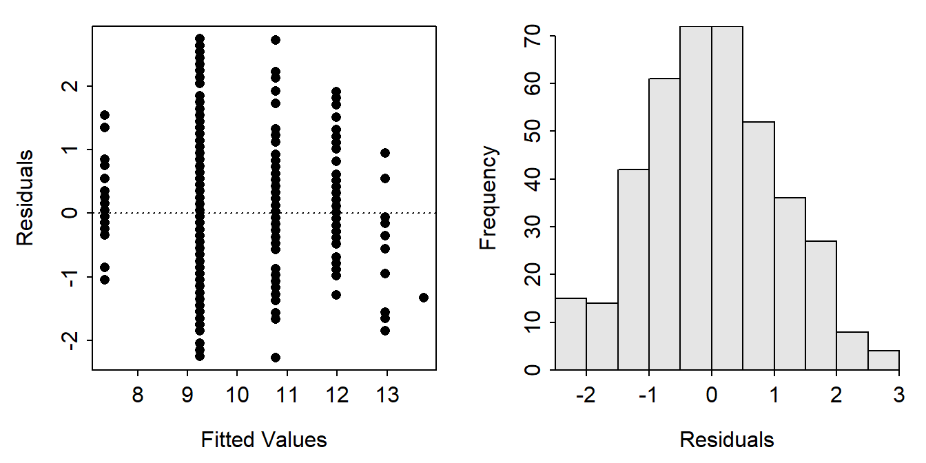
A data frame of the two variables used in the ANOVA appended with the fitted values and residuals from the model fit must be constructed. The rstudent() function does not work for non-linear models, but the Studentized residuals are computed with nlsResiduals() from nlstools. However, these values are “buried” in the Standardized residuals column of the resi2 matrix returned by that function; thus, it takes a little work to extract them as shown below.
tmp <- SpotVA1 |>
  select(tl,age) |>
  mutate(fits=fitted(nlreg),
         resids=resid(nlreg),
         sresids=nlstools::nlsResiduals(nlreg)$resi2[,"Standardized residuals"])
peek(tmp,n=8)
#R| tl age fits resids sresids
#R| 1 6.5 0 7.348034 -0.8480343 -0.8051925
#R| 58 8.3 1 9.251581 -0.9515812 -0.9035082
#R| 115 8.5 1 9.251581 -0.7515812 -0.7136121
#R| 173 9.7 1 9.251581 0.4484188 0.4257650
#R| 230 9.8 2 10.771696 -0.9716957 -0.9226066
#R| 288 10.5 2 10.771696 -0.2716957 -0.2579700
#R| 345 11.5 3 11.985613 -0.4856128 -0.4610802
#R| 403 13.9 4 12.955010 0.9449900 0.8972498
Once this data frame is constructed the residual plot and histogram of residuals are constructed exactly as for linear regression and won’t be repeated here.
Conclusion
The residPlot() function in FSA was removed by 2022. This post describes a more transparent (i.e., not a “black box”) and flexible set of methods for constructing similar plots using ggplot2 for those who will need to transition away from using residPlot().5
5 Different “residual plots” are available in plot() (from base R when given an object from lm()), car::residualPlots(), DHARMa::plotResiduals(), and ggResidpanel::resid_panel().
6 patchwork is used here to place the plots side-by-side.
As mentioned in the examples above, each plot can be modified further using typical methods for ggplot2. These changes were not illustrated above to minimize the amount of code shown in this post. However, as an example, the code below shows a possible modification of the IVR residual plot shown above.6
## Recreate the data frame of results for the IVR
tmp <- Mirex |>
  select(weight,mirex,species) |>
  mutate(fits=fitted(ivr),
         resids=resid(ivr),
         sresids=rstudent(ivr))

## Create a general theme that can be applied to both plots
theme_DHO <- theme_bw() +
  theme(panel.grid.major=element_line(color="gray90",linetype="dashed"),
        panel.grid.minor=element_blank(),
        axis.title=element_text(size=rel(1.25)),
        axis.text=element_text(size=rel(1.1)),
        legend.position=c(0,1),
        legend.justification=c(-0.05,1.02),
        legend.title=element_blank(),
        legend.text=element_text(size=rel(1.1)))

## Construct the residual plot
r1 <- ggplot(tmp,aes(x=fits,y=sresids,color=species)) +
  geom_point(size=1.5,alpha=0.5) +
  geom_hline(yintercept=0,linetype="dashed") +
  geom_smooth(se=FALSE) +
  scale_y_continuous(name="Studentized Residuals") +
  scale_x_continuous(name="Fitted Values") +
  scale_color_manual(values=c("#E69F00","#0072B2"),guide="none") +
  theme_DHO

## Construct the histogram of residuals
r2 <- ggplot(tmp,aes(x=sresids,color=species,fill=species)) +
  geom_histogram(alpha=0.5,binwidth=0.25) +
  scale_y_continuous(name="Frequency",expand=expansion(mult=c(0,0.05))) +
  scale_x_continuous(name="Studentized Residuals") +
  scale_color_manual(values=c("#E69F00","#0072B2"),
                     aesthetics=c("color","fill")) +
  theme_DHO

## Put plots side-by-side (the "+" is provided by patchwork)
r1 + r2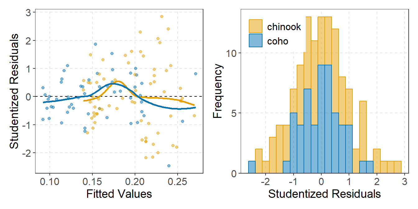
Reuse
Citation
BibTeX citation:
@online{h._ogle2021,
  author = {H. Ogle, Derek},
  title = {Replace {residPlot()} with Ggplot},
  date = {2021-06-01},
  url = {https://fishr-core-team.github.io/fishR/blog/posts/2021-6-1_residPlot-replacement/},
  langid = {en}
}
For attribution, please cite this work as:
H. Ogle, D. 2021, June 1. Replace residPlot() with ggplot. https://fishr-core-team.github.io/fishR/blog/posts/2021-6-1_residPlot-replacement/.